A logo is a start, not the brand identity itself. When color, typography, tone and repetition come together, the brand becomes recognizable — and when scattered, every design starts from scratch.
A new business usually proceeds in this order: first a logo is made, then a business card, then social media visuals, then the site. At each step another person, another color and another font come into play. What emerges six months later is not a brand but a sum of visuals unrelated to each other.
A brand identity is the set of rules that prevents this scatter. The logo is only one part of this whole.
The parts that make up an identity
- The logo and rules of use: On which background which version is used, how much space is left, what is not done.
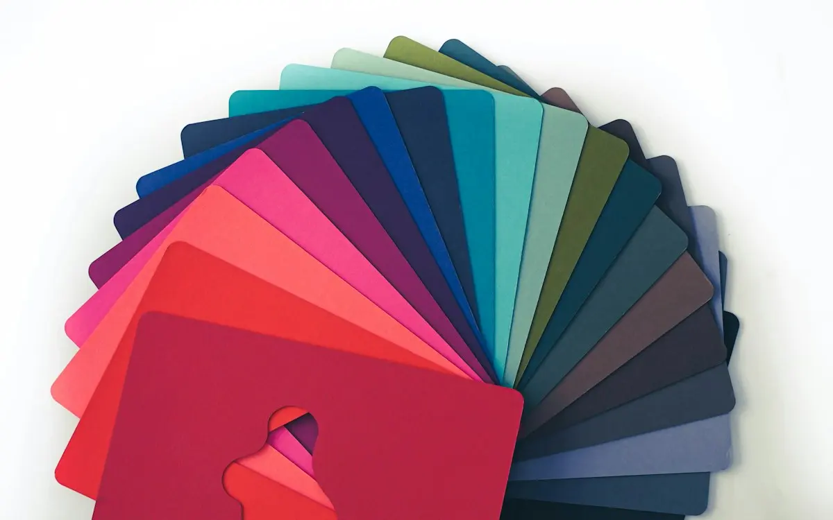
- The color palette: A main color, support colors and their code equivalents. "Blue" isn't enough; which blue it is must be written down.
- Typography: One font family each for heading and text, and which weight is used in which case.
- Visual language: Photo, illustration or icon? Warm or sharp?
- Tone: How the brand speaks — formal, friendly, technical? This is usually not put into writing, and that's why everyone uses their own tone.
Why is consistency related to sales?
Recognizing a brand makes it easier to remember; and a remembered brand is the first that comes to mind at the moment of decision. The human mind works by repetition: someone who sees the same color, the same font, the same tone many times counts that brand as "familiar," and familiarity turns into trust.
In a scattered identity this accumulation never forms. Every post, every brochure stands on its own; the work done over ten months doesn't leave a single brand impression.
What is a style guide for?
The real benefit of a guide is not aesthetics but that it lowers the cost of decisions. When there's a written rule, the debate "which color should we use in this visual" never starts. Also, when the person doing the work changes, the brand doesn't change; the newcomer looks at the guide.
For a small business, the guide doesn't need to be dozens of pages. Color codes, fonts, logo usage rules and a few examples are enough in most cases.
Common mistakes
- Using the logo at the same size everywhere. The logo on a business card and the logo on a sign don't work at the same level of detail; a logo unreadable at small size loses its function.
- Too many colors. Five main colors amount to the same thing as choosing no color at all.
- Using free fonts without a license in commercial use. Copyright issues that surface later can force the redoing of work already sent to print.
- Not receiving the source files. A logo delivered only as a JPG has to be redrawn on every new job. The vector file (SVG, AI, EPS) must absolutely be in the archive.
How does a brand identity project work?
A brand identity project starts before the logo, with a set of questions that pin down who the brand is talking to and how; the logo, colours and typefaces then arrive as the visual answer to those questions. Reverse the order and you end up with a logo that looks good but says nothing about the brand.
A sound identity design process usually runs through these steps:
- Brief and kick-off meeting. What the business sells, who it sells to, how it stands apart from competitors and which channels it will appear on are all put in writing. “Make it modern and clean” is not a brief; “trust for corporate clients, approachability for individual customers” is the start of one.
- Sector review. We look at which colours and shapes other brands in the same field use. The goal is not to copy them but to avoid disappearing into the crowd.
- Logo concepts. Several different directions are presented, each shown in a real-world setting: a business card, a social media profile picture, a shop sign, a website header.
- Colour and typography system. Primary and secondary colours, plus heading and body typefaces, are built around the chosen logo.
- Application examples. The everyday pieces are prepared: letterhead, email signature, presentation template, social media templates.
- Guidelines and handover. The rules are gathered into a single document and the source files are delivered in well-organised folders.
The step most often skipped is the application examples. A logo looks great on a desktop screen, then the first social media post reveals it doesn’t fit inside a round profile frame. Testing the identity in real use prevents corrections further down the line.
The business also has a job in this process: one person should make the decision. When every concept is shown to five people and everyone’s preferences get folded in, the result offends no one but no one remembers it either. Giving feedback against the goals in the brief, rather than “I like it, I don’t like it”, makes revision rounds both shorter and more meaningful.
Brand identity handover checklist
What you need to check at handover is whether you have the files another designer would need to apply the identity correctly without ever speaking to you. The list below is enough to test that:
- Vector logo: SVG, AI, EPS or vector PDF. Essential for print and large formats.
- Logo variations: Horizontal, vertical, icon only, single colour, and a light (reversed) version for dark backgrounds.
- Square use: A simplified version for social media profile pictures and the site icon (favicon).
- Colour codes: HEX and RGB for screen, CMYK for print; Pantone equivalents if you’ll be working with a printer.
- Typefaces and licences: Which typefaces are used, who holds the commercial licence and whether they can be used on the web.
- Usage rules: Minimum size, clear space around the logo, and what not to do (stretching, drop shadows, changing colours).
- Rights: A written document showing that the usage and economic rights to the logo have been transferred to you.
Every item missing from this list turns into a “we couldn’t find the file” problem on some future job. Even if you part ways with the person who designed the identity, the brand should stay with you.
Run a quick test on the day you receive the files: place the logo on a social media graphic, a document template and a dark background. If a variation is missing or a colour code is wrong, it is far easier to spot before the project closes than months later. Keep the handover folder in one place that more than one person can access.
What determines the cost of brand design?
The main factor behind the cost of an identity project is scope: do you want just a logo, a logo plus a core system, or a full identity including every everyday application? All three can be sold under the same “corporate identity” label, yet they involve very different workloads.
Alongside scope, these items also change the price:
- The number of logo directions presented and the number of revision rounds.
- Whether a brand name also needs to be created.
- The number of applications to be prepared: packaging, signage and vehicle wraps each require separate design work.
- The level of detail in the guidelines.
- Paid font licences; these are a separate cost from the design fee.
When comparing quotes, don’t look only at the total; check which of these items are included. Anything left out will come back later as a separate job. For businesses on a tight budget, the sensible route is to narrow the scope: start with the logo, colours, typefaces and a few core templates, then add other applications under the same rules as the need arises. A solid foundation can be extended later. To see what is included, visit our graphic design and brand identity page, and for a more detailed list of the parts that make up an identity, read our article on what a corporate identity should include.
Frequently asked questions
Every how many years should I renew my logo?
There's no calendar-bound rule. Renewal makes sense when your business model or target audience changes. A change made just because you're bored zeroes out the accumulated recognizability.
How long until results from identity work?
The identity itself is prepared within weeks; but its effect emerges with repetition. Unless it's used consistently for the few months after the new identity goes live, the difference isn't felt.
Does a small business need a style guide?
If more than one person produces visuals, yes. Even if one person produces them, it helps you remember your own decisions six months later.
Is corporate identity the same as brand identity?
In everyday use they often mean the same thing. Corporate identity usually refers to the visual system (logo, colours, typefaces, print and digital applications), while brand identity adds tone, values and positioning on top of that. In practice, handling the two together is what creates consistency.
Can I keep my existing logo and still have an identity project done?
Yes. If the logo has built up recognition, keeping it and building colours, typography and usage rules around it is often the right call. Where needed, the logo gets only small tweaks to improve legibility; this does not wipe out the recognition it has earned.
Who owns the rights to the logo?
That depends on your agreement with the designer. It should be stated in writing that the usage and economic rights to the logo are transferred to you. If you plan to register a trademark, this document will also come in handy.